The Body Factory is a women only health and beauty centre. They have a gym, pool, beauticians, sauna, tanning rooms, hair salon and cafe all under one roof. My brief was to redesign their logo and merely update the website's look whilst maintaining the site structure. I started with the logo by using the universal symbol for female. I added a
heart to the circular part of the symbol to communicate the idea of an all encompassing health centre. I created the name in a lower case font to make it seem more informal as gyms can be quite daunting places to people that have never been to one before. Pink was a colour that was already used widely as an interior colour for the health centre so
I used that in the site to maintain consistency and branding. I also used very thin and light graphical elements throughout the site to give a feeling of delicacy to enhance the feminine aspect to the centre. I also used white to create a clean look as opposed to a black and distressed look that you may find with a typically male dominated gym. I also
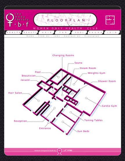
incorporated a symbol set on the site which transfers into the gym itself as signage to help people find the correct part of the health centre. To contrast the pink and to not make the site appear overly feminine I used a black background with a subtle wallpaper effect. I also incorporated a floor plan to give people a sense of scale as passers
by may not realise that something this big exists and extends as far as it does from merely looking at the shop front as it is deceptive from the outside. The original site used type in various sizes and colours and centred creating a completely confusing user experience. I stuck to a very simple grid structure to make the site as simplistic as possible
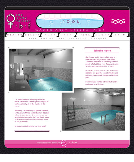
and effortless to find information. I also pulled out the pink colour in the photographs that were supplied in order to further enhance the cleanliness of the site. Each page has it's own individual header graphic to create some visual stimulus and fun. I felt that giving the feeling of fun, ease of use and cleanliness were important to women.