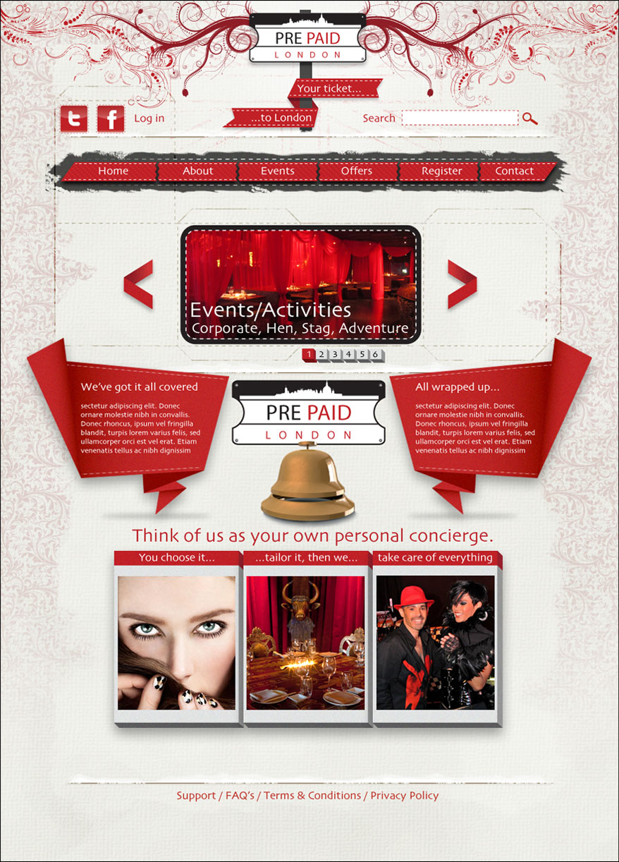
Pre-Paid is a new start up company that organises events and functions. They can arrange Hen nights to Bond style adventure weekends. They arrange everything and arrange payment for any and all potential hidden charges so that they can simply turn up and enjoy the ride. The screenshot below was for the the initial pitch. They wanted a logo and
a single page design initially to gauge look and feel. They initially wanted to appeal to the luxury end of the market and used words such as bespoke, gourmet and opulent but with a London feel. I designed the logo and based it around a London street sign. Some street signs use graphics added to the top especially in the West End so I
incorporated a London skyline into the design. I also cut half circles in either end to form a ticket shape to suggest an event oriented business. I also used red and black as these colours are consistent with current London street signs. I also used red, black and gold for the rest of the page design as these colours are traditionally used by many
London icons. For example, black taxis, red phone boxes, Royal Mail letter boxes, grenadier guards all use red black and gold in some form. Black suggests sophistication and red exudes warmth and passion which together I felt typified the luxury end of the market. The gold also adds the feeling of richness. The client was also very specific about
using a repeating floral type wallpaper background which I also incorporated to enhance the rich feeling. I also added a cream canvas textured background to lighten the look which the clients liked. I also added more floral elements to the header area as London does have lots of green space which I think contrasts well with the urban London street sign.
I also thought about the bespoke feeling that the client wanted and immediately thought about tailors and hand stitching. I decided to incorporate that into the page design to give that hand made look but also used it to denote interchangeability to make people feel as though their event is not merely off the shelf and is customisable. I also added
an unfurled packaging net to suggest that the events and functions that are pre-paid and packaged can be customised. This would have been utilised as a page element in lower level pages once a user had selected a theme or event. I also added simulated folded paper text boxes to enforce the 'we've got it covered' message the client
wanted to convey. I also used 3D elements again to give the packaged and taken care of feeling. The client described their business as 'a personal concierge service.' I feel the red and black also typifies the colours of celebrity ceremonies in regards to the use of red carpets and black and white dinner suits and suits the events side of the
business. I also used some distressed elements as the client also wanted a 'gritiness' to be applied. Once submitted to the client they decided to change their target audience completely and go for the cheaper end of the market but they wanted to keep the logo and certain page elements. The site design was changed and this concept was shelved.