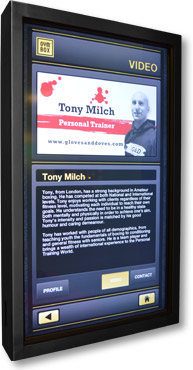
Gloves and Doves is the training camp for Tony Milch, a personal trainer at Gymbox Gym that specialises in boxing training. Tony told me that the gym was introducing several touch screen displays that would incorporate Personal Trainer's profiles. Each personal trainer has a 'slot' on the personal trainers section that allows for a static profile
picture and a video. Members of the gym can then browse for personal trainers and see what their specialities are. First of all I started with the Gloves & Doves logo which was based around a ying yang symbol so i thought I'd actually animate the transformation from a ying yang symbol into the Gloves & Doves symbol to emphasise the ethos behind
the logo even more. I then morphed the central circle shape from the Gloves & Doves logo into the Gymbox logo's square. I decided that I liked the simple shape morph animation and looked at other shapes. I'd already chosen a segment of music to accompany the video which I thought was fitting as it was a remix of Daft Punk's Harder, Better,
Faster, Stronger. I thought that I would synchronise the animation to the music and depict the words of the lyrics plus add words to make them relevant to training. Such as instead of just Harder I would add Train or Hit Harder. I then set about designing the symbols that would morph from one into the other. Because the music repeated itself through four
cycles I decided to create two different cycles of animation that would repeat twice. One cycle would be for people looking just to train for the conditioning and fitness benefits and the other for those looking to actually box and compete in the ring. I decided to depict the first set of words in a small scale as the music starts quietly and fades in.
Then once the music reached full volume I introduced the animated morphing symbols without words to prepare people for the format of the video. The first set of symbols used a mixture of symbols from both cycles with one symbol being a reference to the home page of the website which is a Superman logo. Then the first round of
symbols and words comes in followed by the next wave. In between each cycle there's another set set of lyrics that I changed slightly to lend meaning to the training theme and this is depicted by a fast spinning clock. At the end of the cycle the central shape disappears and the distressed red stripe appears across the screen the same way as it does
across the business card design. Then Tony himself appears on screen looking back at his name, title and URL of the site. I shot video of Tony against a green screen wearing a G&D branded hooded sweatshirt so that people can see who the trainer is once again. The music and animation is fast paced and high energy to match that of boxing training. I chose
the music because meaning could be attached to the lyrics using simple word play and symbolism. I wanted people to feel energised, enthused and warm to the brand in the hope that altogether it would intrigue people enough to drive them to the website. As a promotional tool I feel it worked well. See for yourself below...